2032

With over 30 years of experience and a respected commitment to providing quality and authentic tastes, DIANA has become a well-known and trusted name in the industry.
It's a company that knows its solid and strong past but has always looked forward with openness and courage towards the future, which is why it continues its journey with a new chapter, a new visual identity designed to revitalize the DIANA image.
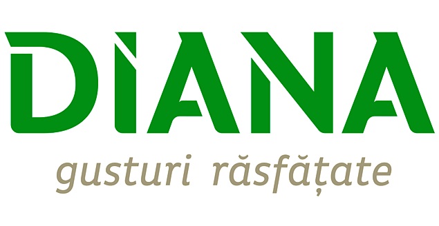
Because success depends on adaptation and the courage to accelerate change, the new DIANA logo has a contemporary shape but carries forward, in a proactively adapted approach to market dynamics, the defining elements: the name and the green color.
At the same time, the logo integrates a message adapted to the company's objectives - that of indulging the tastes of all ages. It's a current logo that maintains the identity given by the founder, being both new and traditional at the same time, through image and message, with a color code in line with current semantics.
The objective was to further capitalize on the relevant, well-known, and recognized brand elements but in a reinterpreted, modern form that addresses all segments.
The update has also extended to the product packaging, being applied to the entire product portfolio, structured into 4 ranges: Mainstream, Upper Mainstream, Noble, and Premium, to match the new visual identity and to ensure an attractive experience for consumers.
The new design includes, as a common denominator, the basic identity elements, unified at the level of graphic concept, ensuring recognizability through product viewing frequency and differentiating elements, to simplify the quick identification of the DIANA brand and range on the shelf.
This change comes naturally but calculated and assumed, after a period in which the company focused on consistent investments for expansion, improving production capacities and capabilities, on projects aimed at implementing energy efficiency measures, followed by processes of mapping, standardization, and streamlining of flows, and adjusting strategies to market changes.
After months of intense analysis and planning, the company embarked on this extensive and consistent rebranding project from a future-oriented perspective, but balanced, designed to reflect the established identity and values, to strengthen the connection with traditional segments, but also to successfully attract new categories and generations of consumers.
The company's strategic vision is to maximize the brand's stature and become a top choice for consumers seeking indulgent tastes and reliable products.


